If you’re looking to add some excitement to your website or app, one way to do so is by incorporating animations. Animations can draw attention to important elements, provide visual feedback, and enhance the overall user experience. In this blog post, we’ll walk through how to create a bouncing keyframe animation in CSS and HTML.
Step 1: Set up your HTML
The first step is to set up your HTML file with the elements you want to animate. For this example, we’ll use a simple div element.
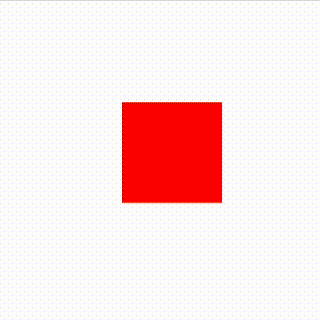
We’ve set up a div with the class “box”, which we’ll use for our animation. We’ve also added some basic styles to center the div on the page and give it a red background color. Notice that we’ve added an “animation” property to the “.box” class with a value of “bounce”. We haven’t defined “bounce” yet, but we will in the next step.
<html>
  <head>
    <style>
      .box {
        width: 100px;
        height: 100px;
        background-color: red;
        position: absolute;
        top: 50%;
        left: 50%;
        transform: translate(-50%, -50%);
        animation: bounce 1s infinite;
      }
    </style>
  </head>
  <body>
    <div class="box"></div>
  </body>
</html>
Step 2: Define the keyframe animation in CSS
The next step is to define the keyframe animation in CSS. Keyframe animations allow you to specify how an element should change over time. In our example, we’ll create a bouncing animation by moving the div up and down.
@keyframes bounce {
  0% {
    transform: translateY(0);
  }
  50% {
    transform: translateY(-50px);
  }
  100% {
    transform: translateY(0);
  }
}
Here, we’ve defined the “bounce” animation using the “@keyframes” rule. We’ve specified three keyframes: one at the beginning of the animation (0%), one at the halfway point (50%), and one at the end (100%). Each keyframe has a “transform” property that changes the position of the div. In the first keyframe (0%), we set the div’s translateY property to 0, which means it will start at its initial position. In the second keyframe (50%), we move the div up by 50 pixels by setting its translateY property to -50px. In the third keyframe (100%), we return the div to its original position by setting its translateY property back to 0.
Step 3: Add the animation to your element
The final step is to add the animation to your element using the “animation” property.
.box {
  animation: bounce 1s infinite;
}
Here, we’ve added the “animation” property to the “.box” class. The value of “bounce” refers to the name of the keyframe animation we defined earlier. The “1s” value specifies the duration of the animation (one second in this case), and “infinite” specifies that the animation should loop indefinitely.
And that’s it! You should now have a bouncing keyframe animation on your webpage. Of course, you can customize the animation by adjusting the keyframe values
Final Code:
<html>
  <head>
    <style>
      .box {
        width: 100px;
        height: 100px;
        background-color: red;
        position: absolute;
        top: 50%;
        left: 50%;
        transform: translate(-50%, -50%);
        animation: bounce 1s infinite;
      }

      @keyframes bounce {
        0% {
          transform: translateY(0);
        }
        50% {
          transform: translateY(-50px);
        }
        100% {
          transform: translateY(0);
        }
      }
    </style>
  </head>
  <body>
    <div class="box"></div>
  </body>
</html>